Reach Marketing Database Selection Tool
Reach Marketing, a data-driven marketing firm, tasked North Street with creating the visual design and user experience for their new email database selection tool.
I took the lead in the strategy and execution of this project, including communicating with the client and building interactive prototypes. I introduced new rapid-prototyping processes to North Street's work flow which helped us show the client how the final product would function. The prototypes also helped the client give us clear feedback.
1. The Goal
Create tool for Reach Marketing's clients to select recipients for their email campaigns.
2. The Process
Kickoff Meeting
North Street Creative began the process with a three-hour kickoff meeting with a multidisciplinary selection of Reach Marketing employees. Reach Marketing presented us with their idea of the project, and we followed up with a series of questions to make sure we had a good foundation to start the project on.
Competitive research
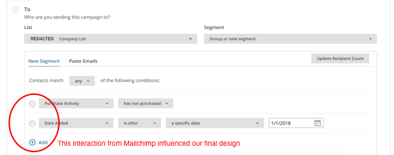
After the kickoff meeting, I researched competitors in the field of email marketing, such as Mailchimp and Hubspot.
This screenshot shows how users create segments for email campaigns in Mailchimp. The parameter addition and subtraction buttons in this interface influenced my designs later on in the process. I felt that these buttons were a simple and clear interaction that we could adapt for the Reach Marketing email tool.
User Persona
Based off of what Reach Marketing told us about their client, Northwell Health, We created a user persona of someone who would be using the email selection tool. Throughout the design process, we kept Rebecca in the back of our minds. With every decision, we asked "are we serving Rebecca's Needs?" This kept us focused on the user.
User Flow
Linear Site Map/features list
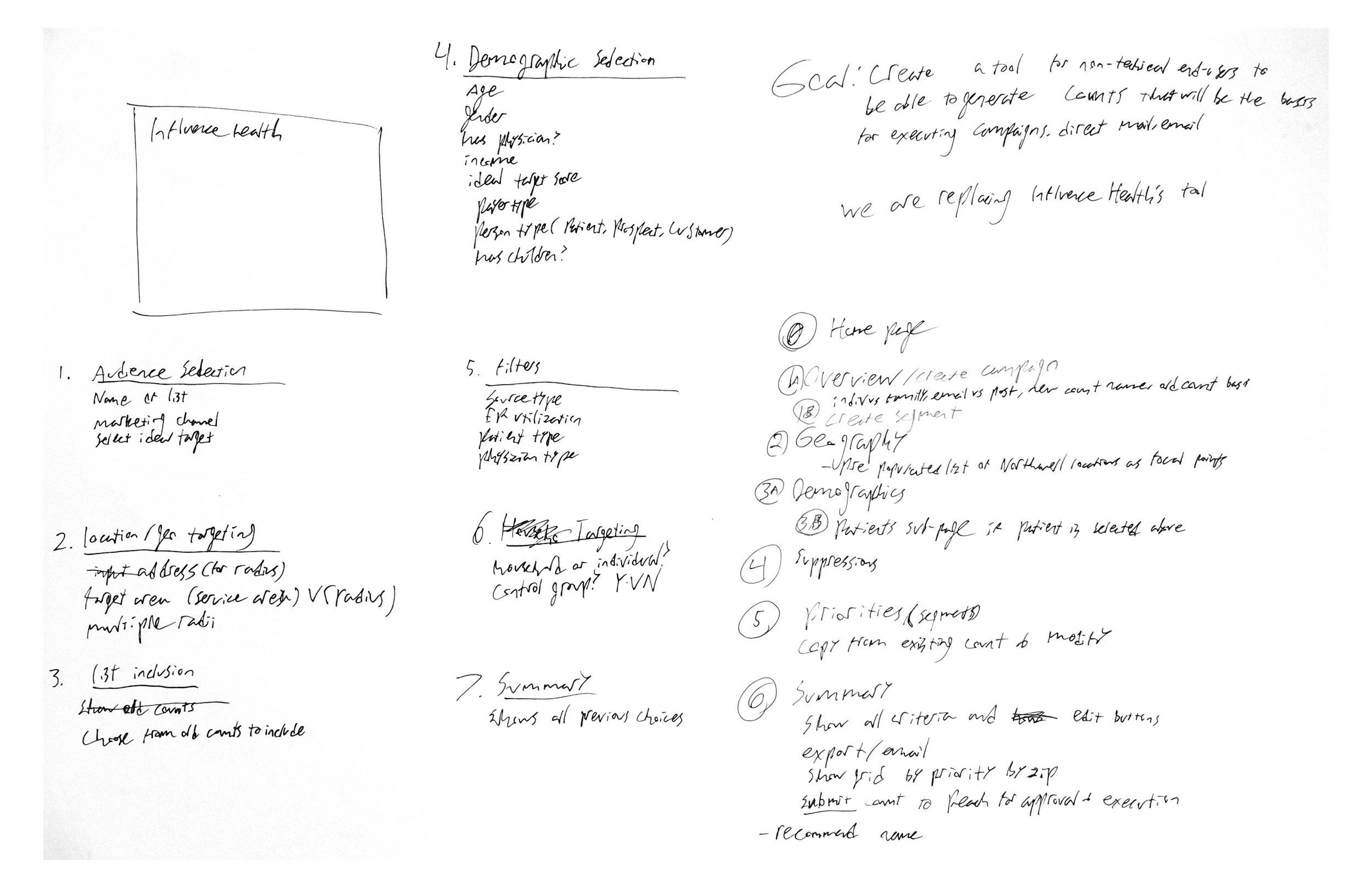
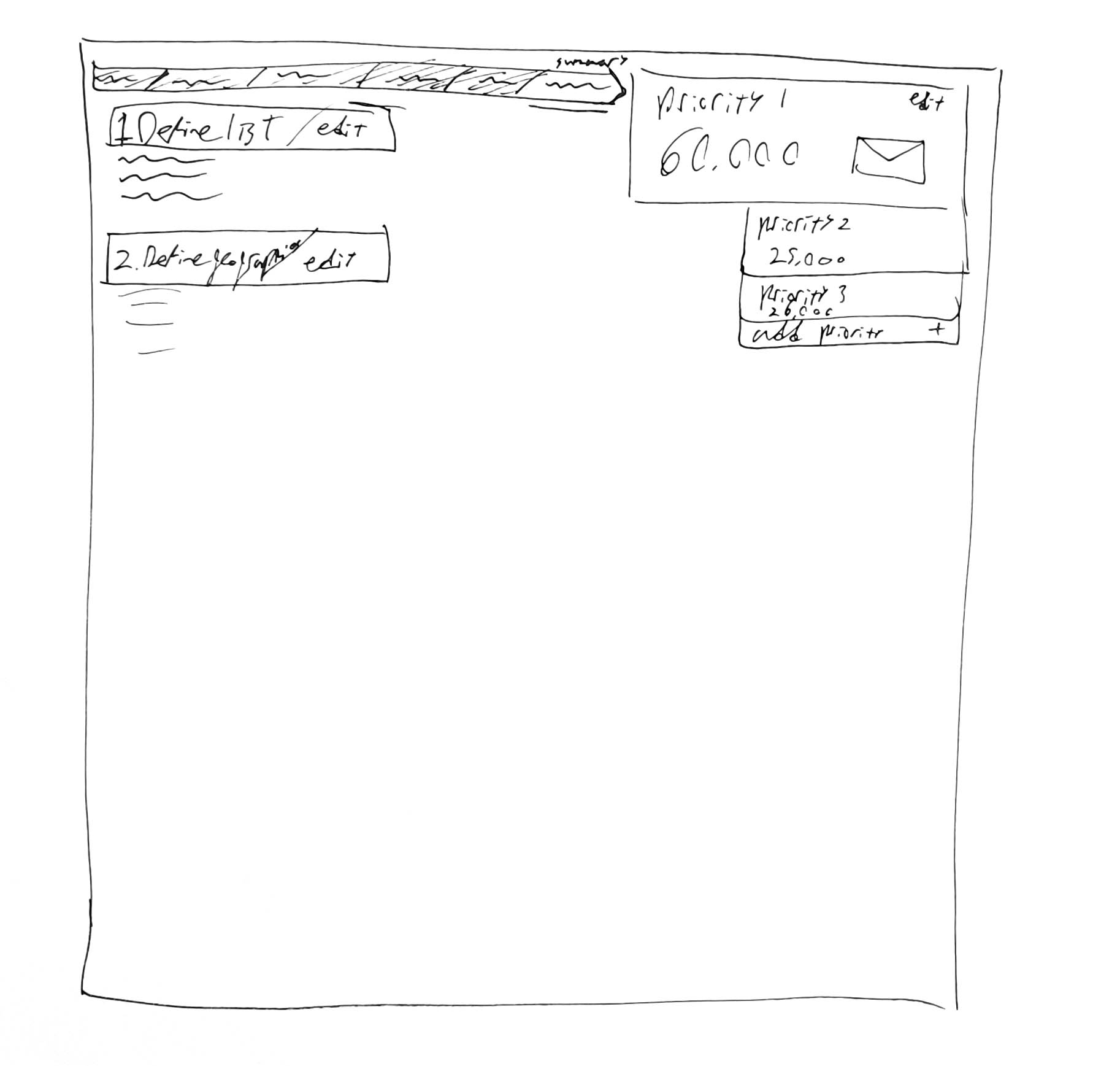
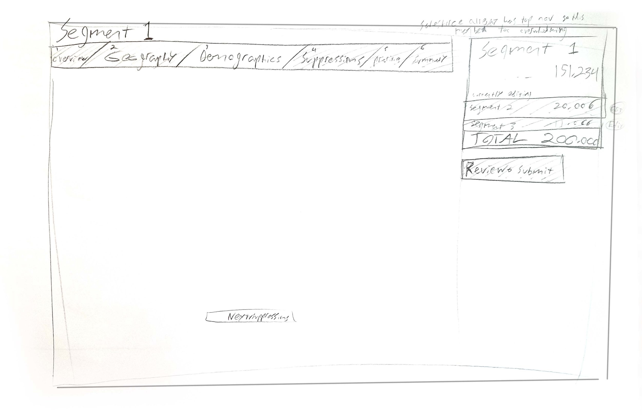
Sketches
I made several sketches of interface possibilities. These are some that have a clear connection to the final designs.
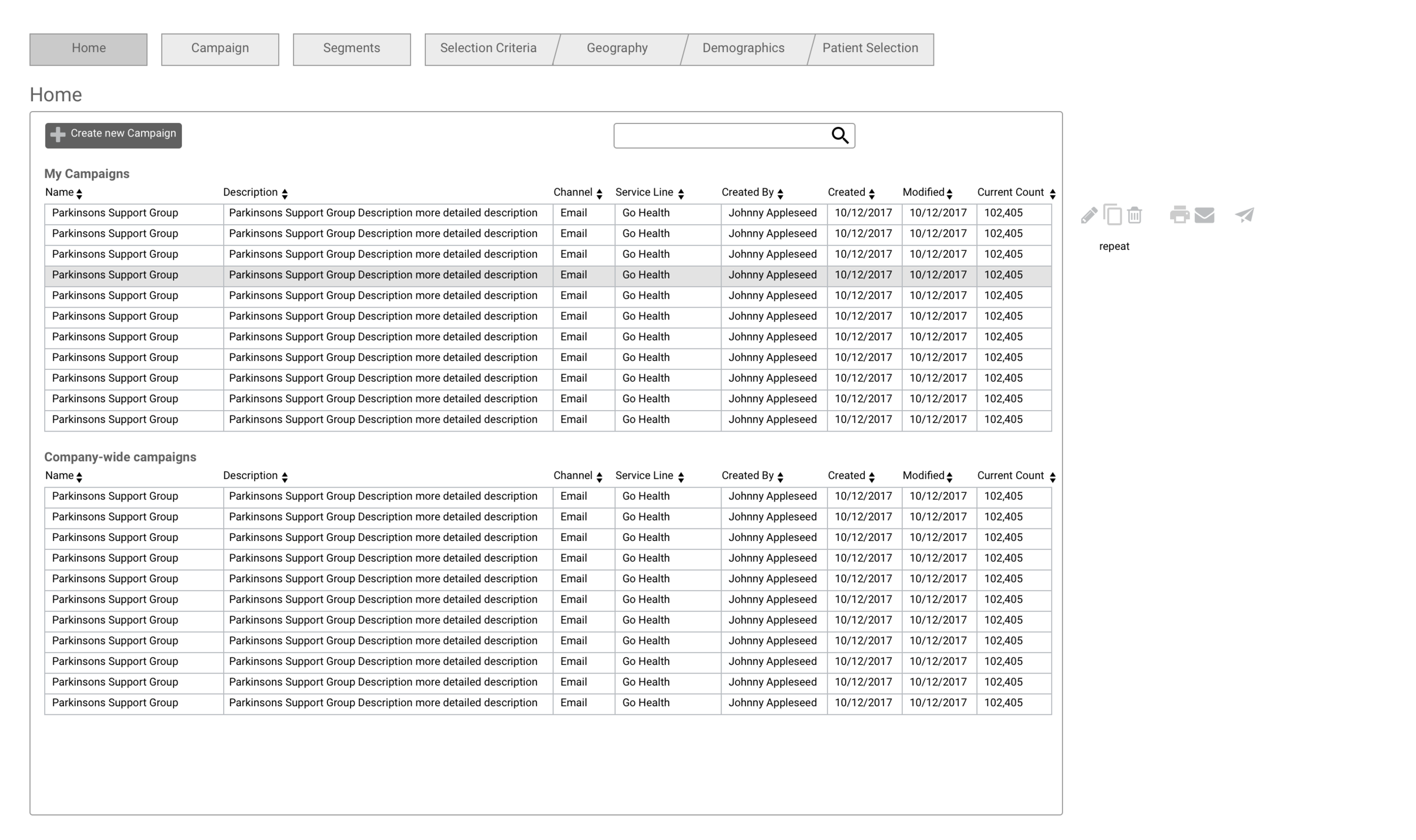
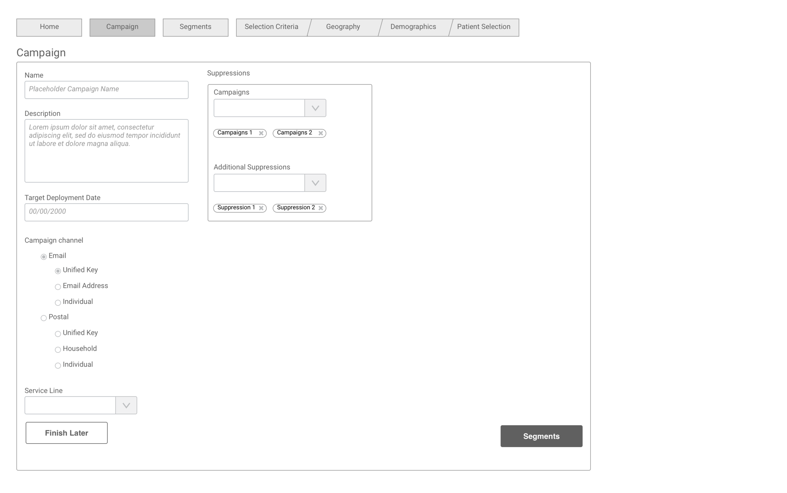
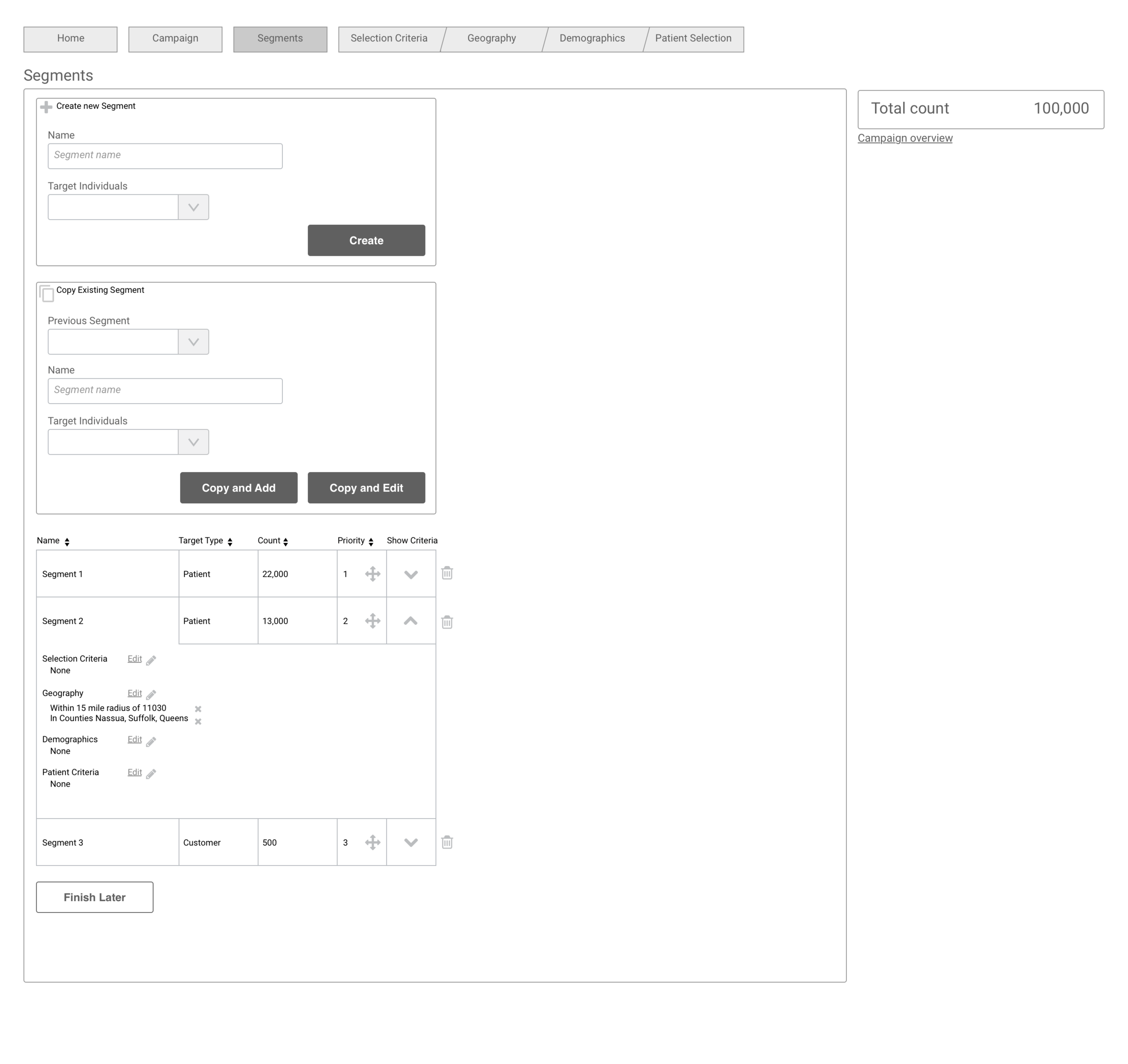
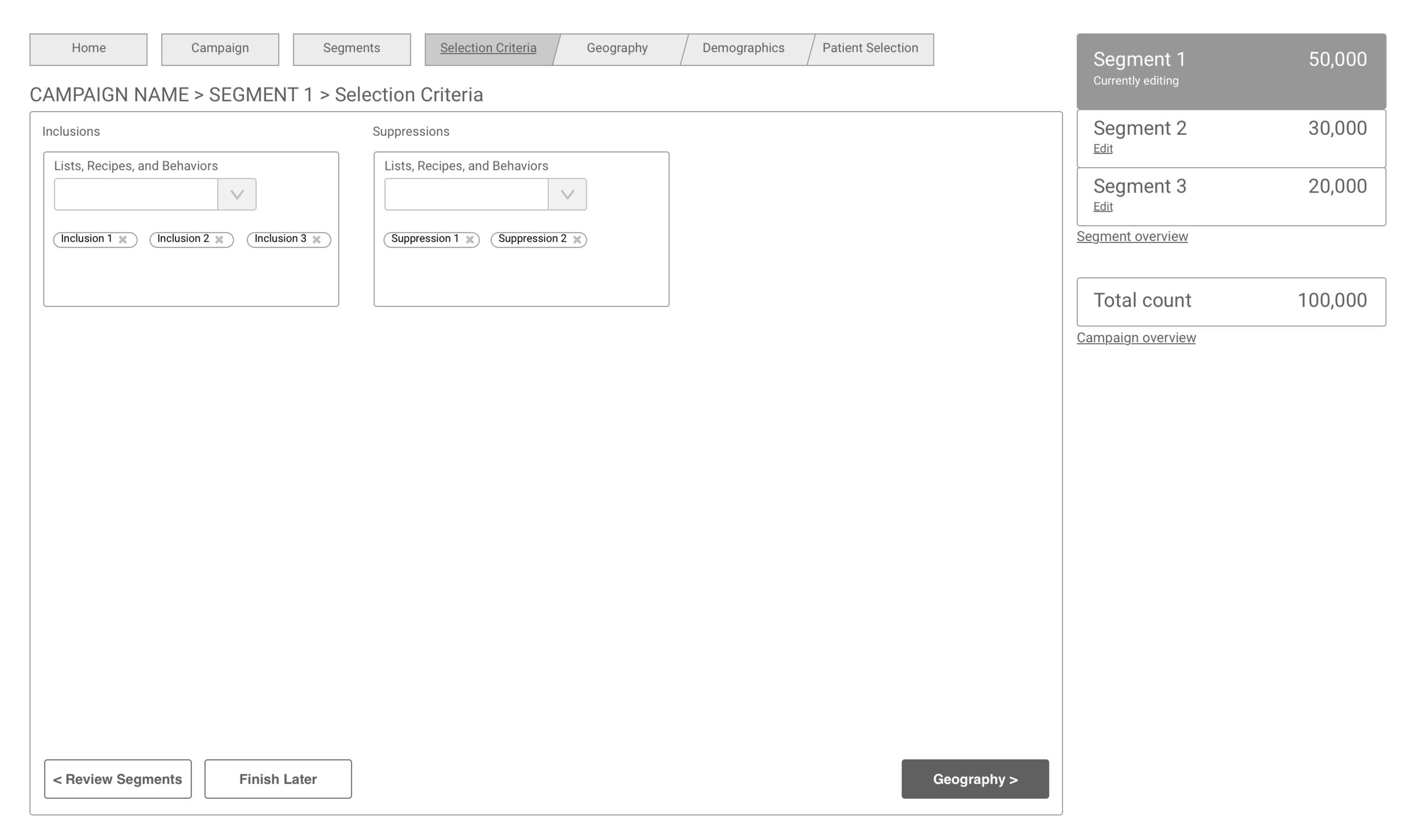
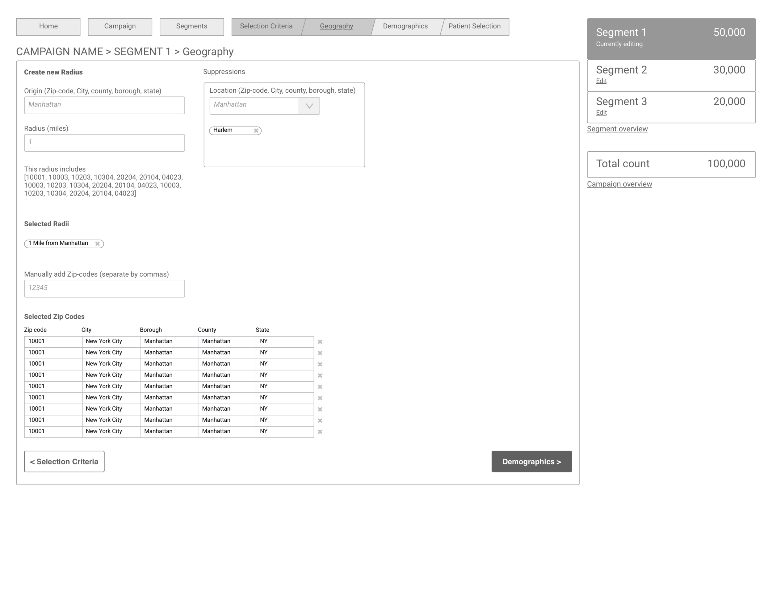
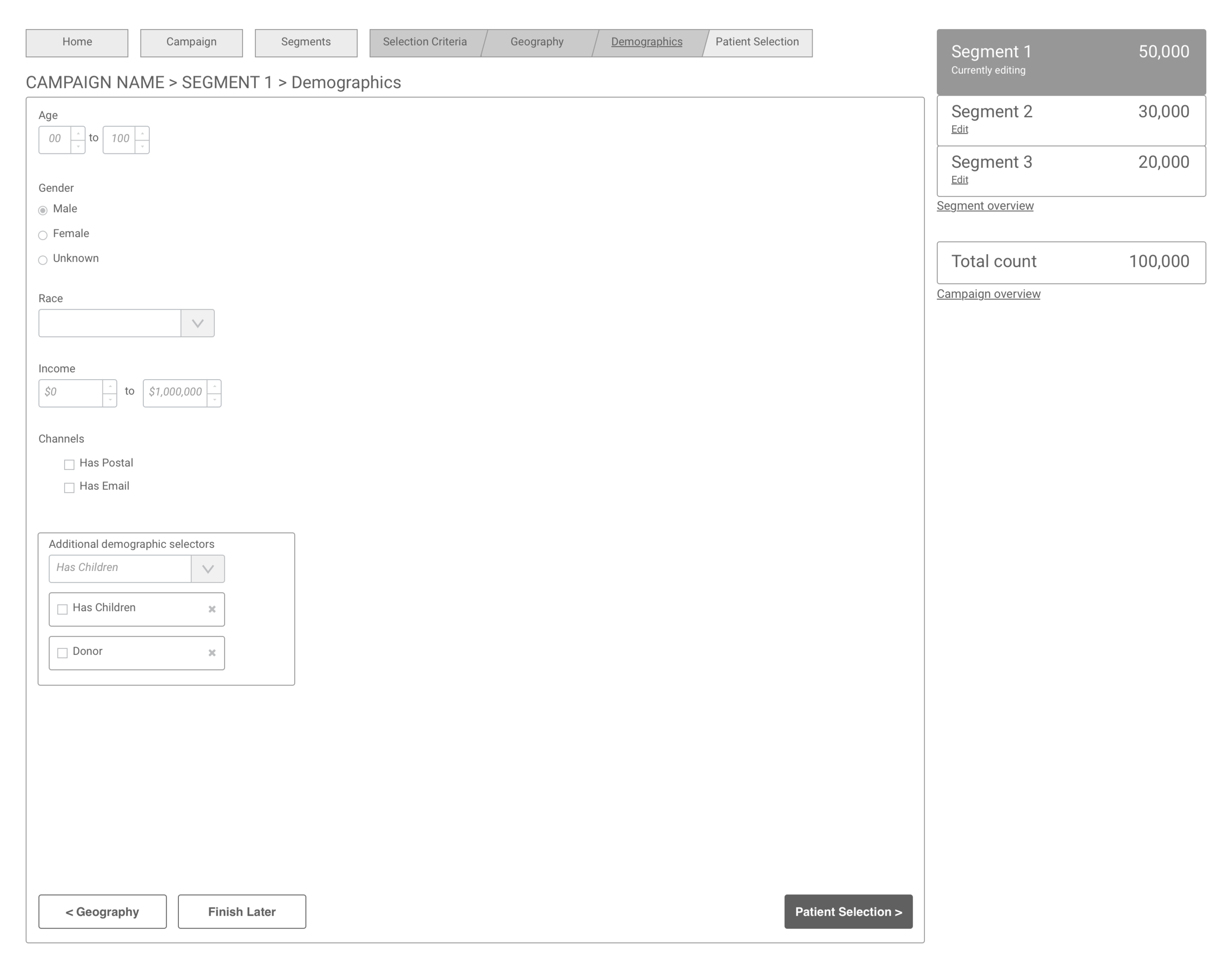
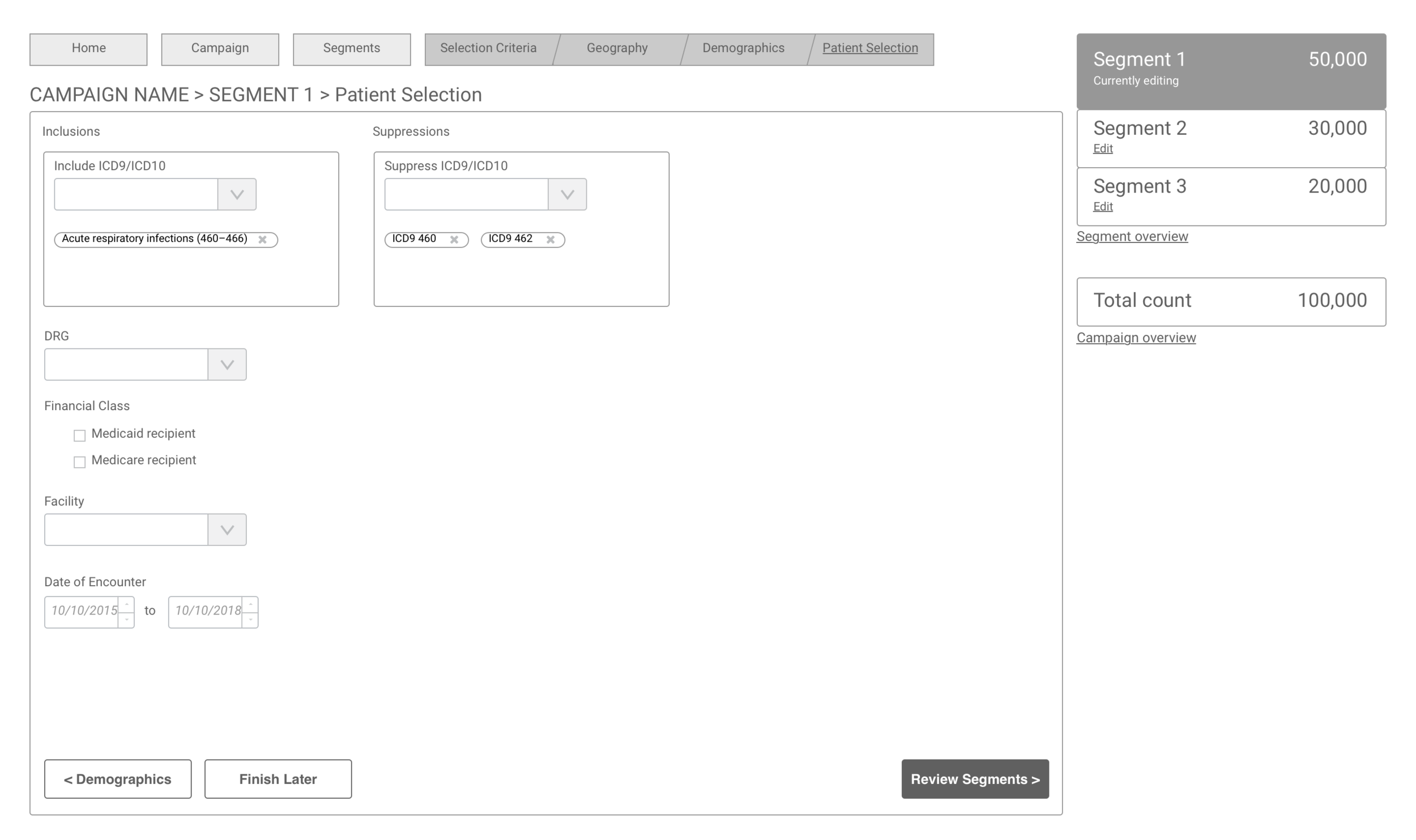
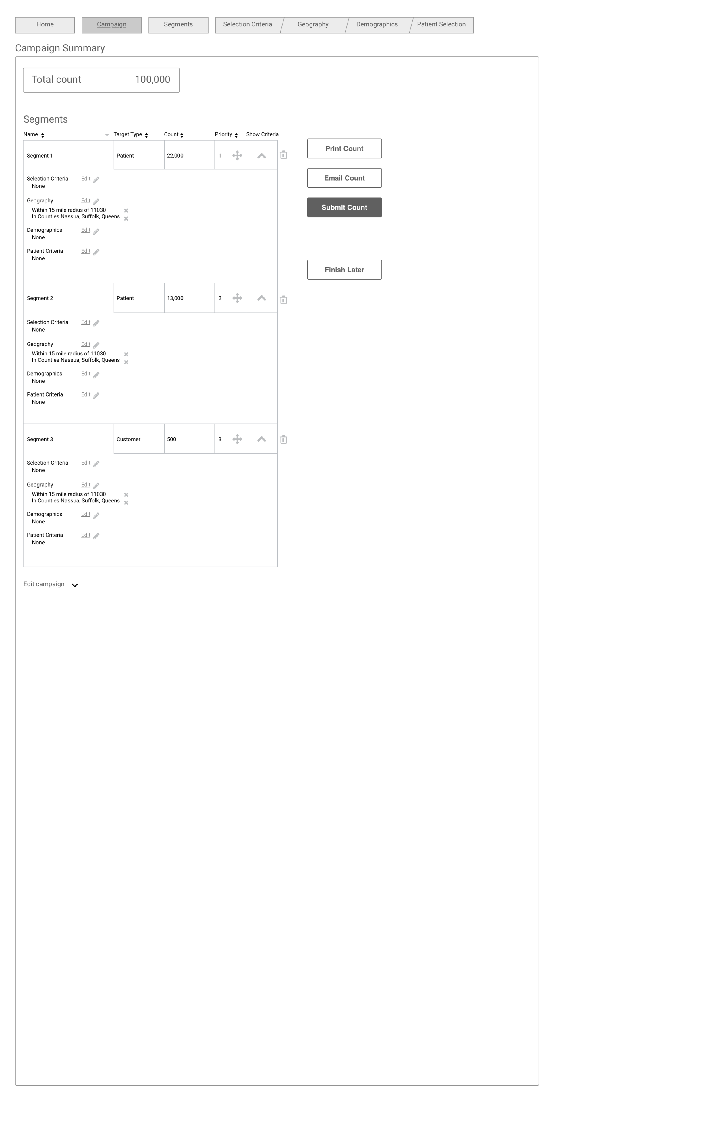
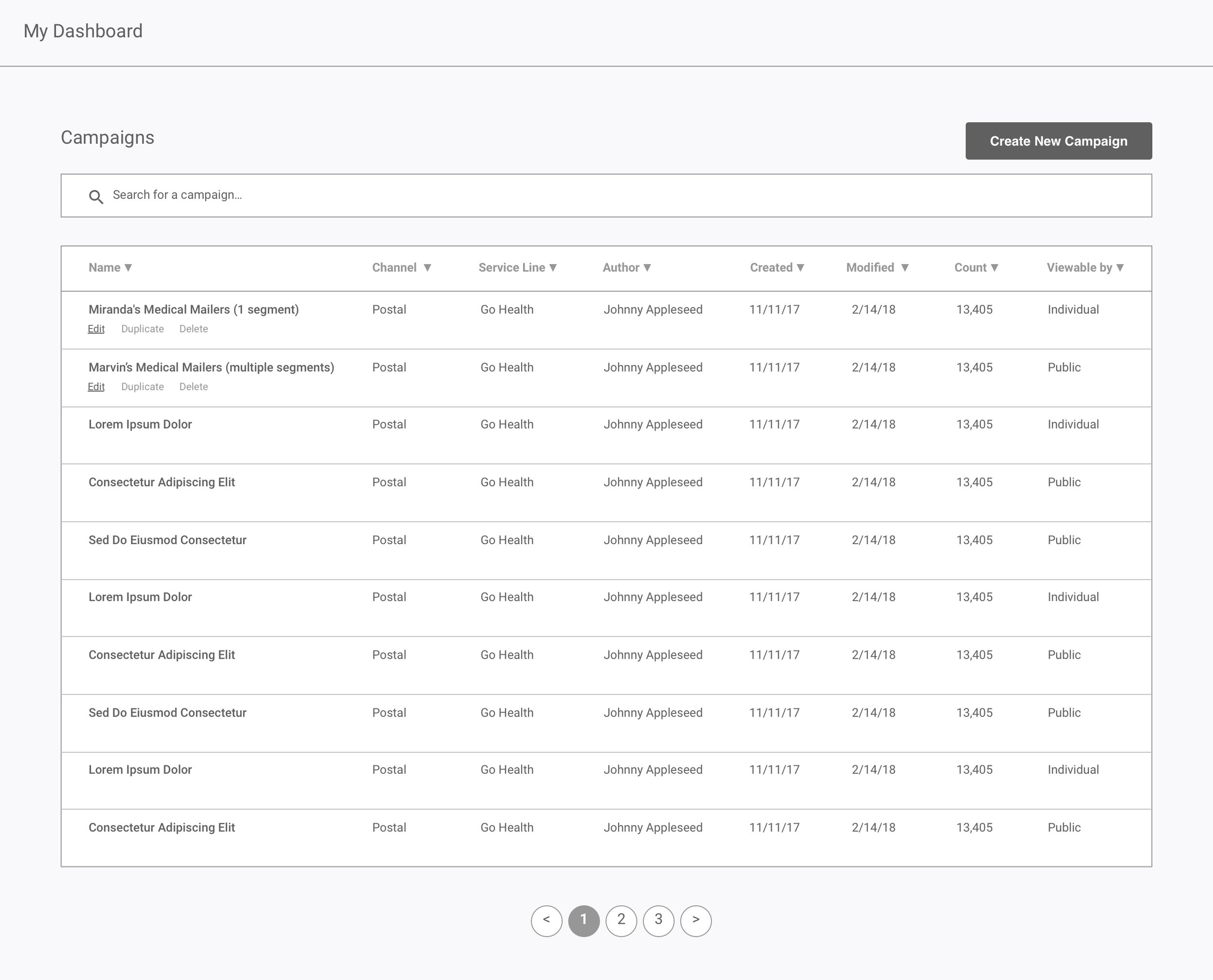
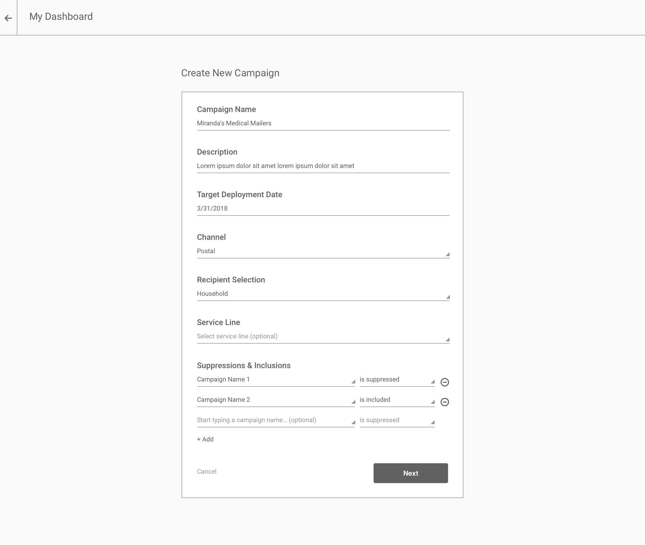
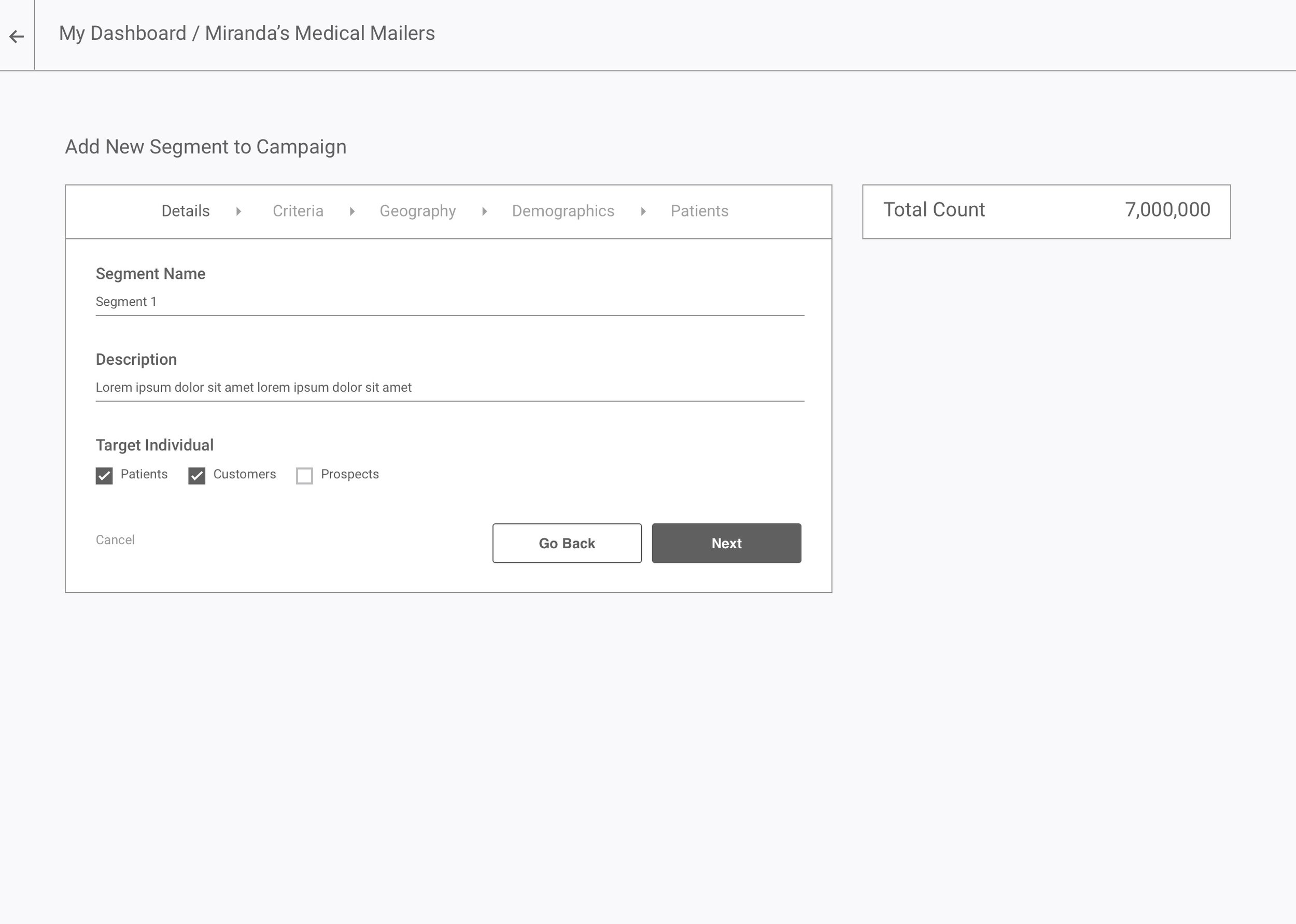
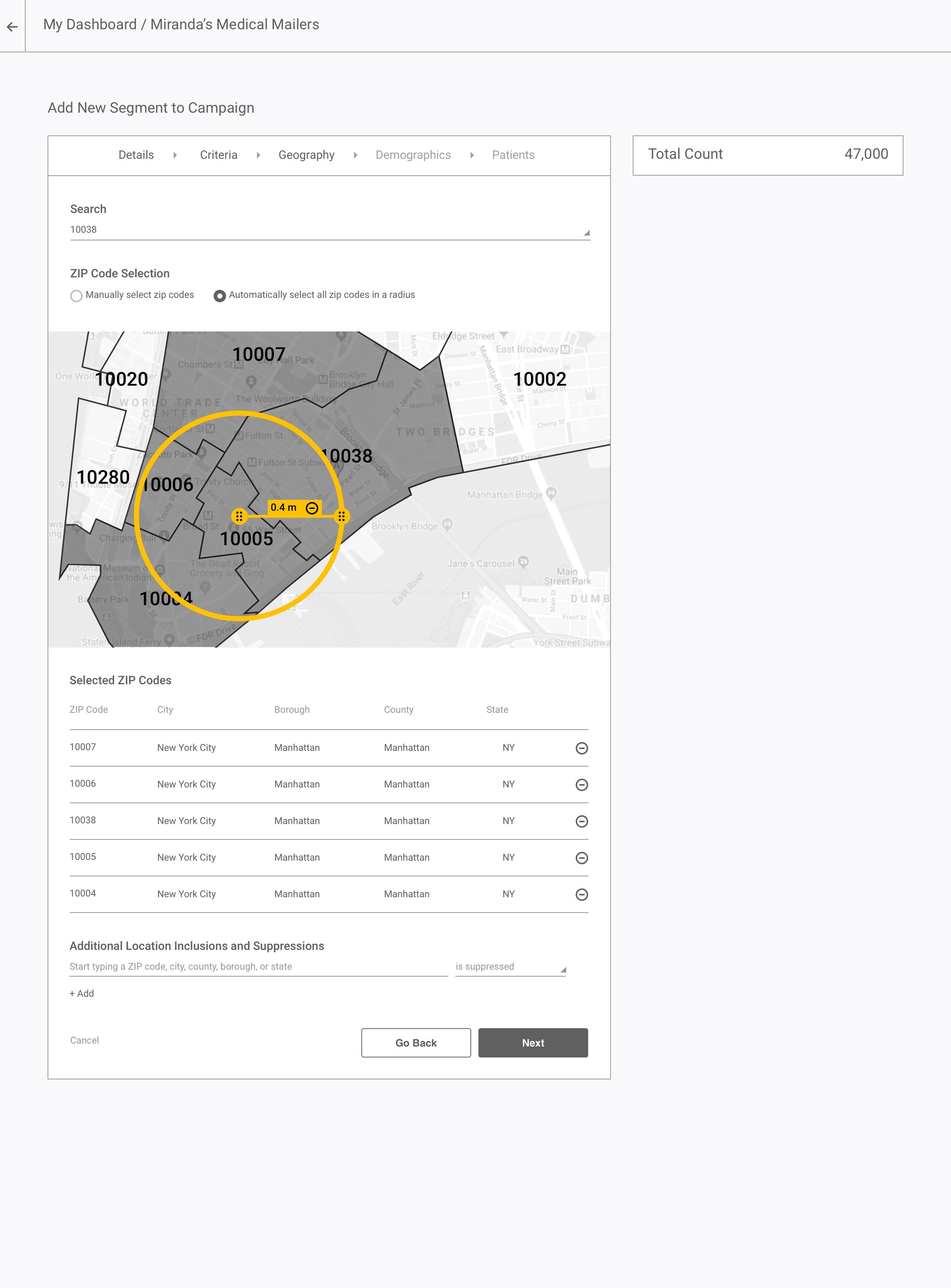
Low-fidelity Wireframes
High-fidelity Wireframes
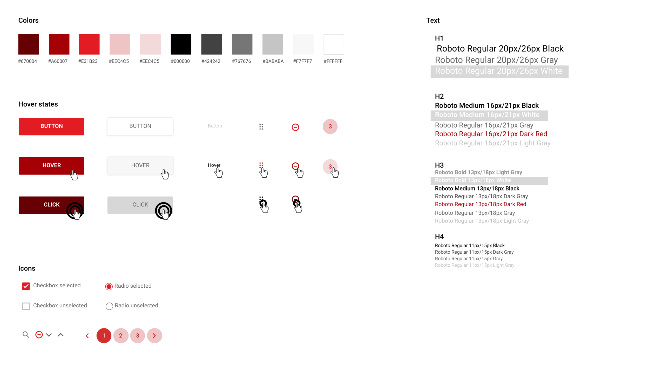
Style Guide
Style guide created for the developers to reference, and also to help myself keep designs internally consistent.
I made liberal use of Sketch symbols, nested symbols, object styles, and text styles. This allowed me to easily make global changes to the design. For example, the client asked us to change the color of the app from blue to red. Because our Sketch file was so well organized, this only took a few clicks.
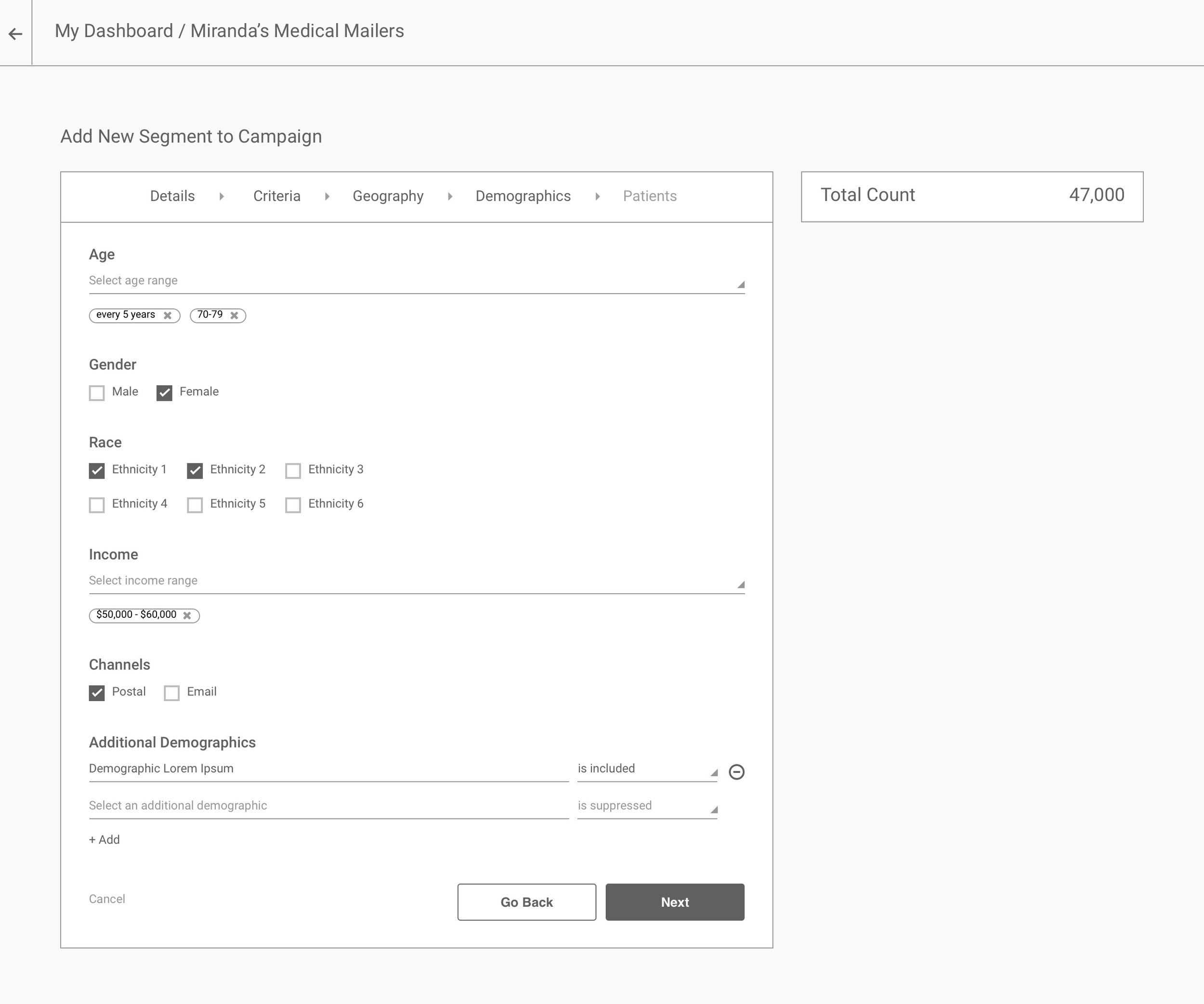
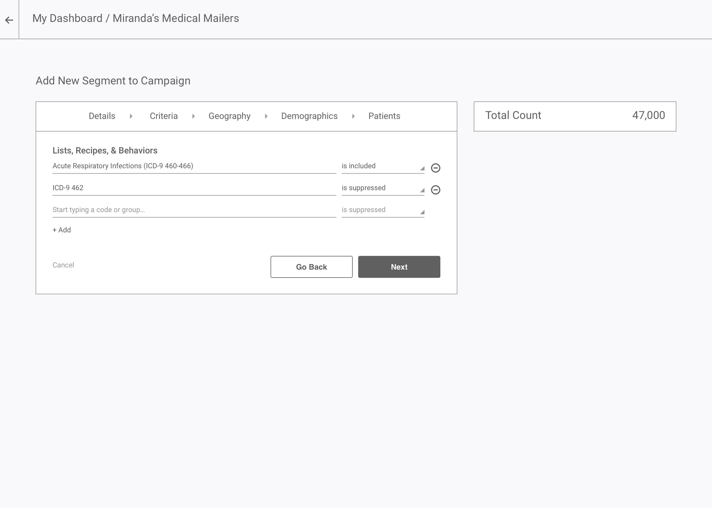
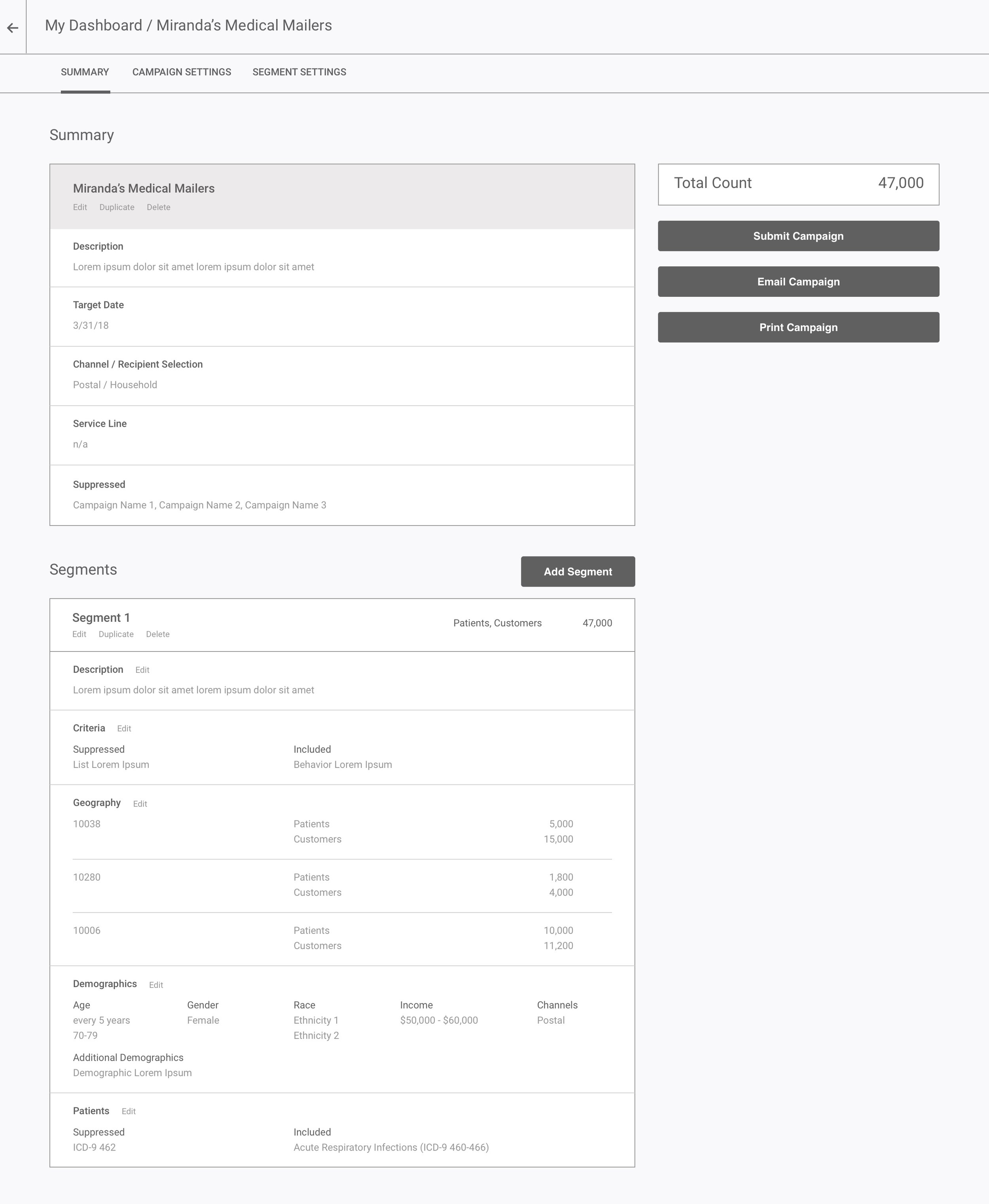
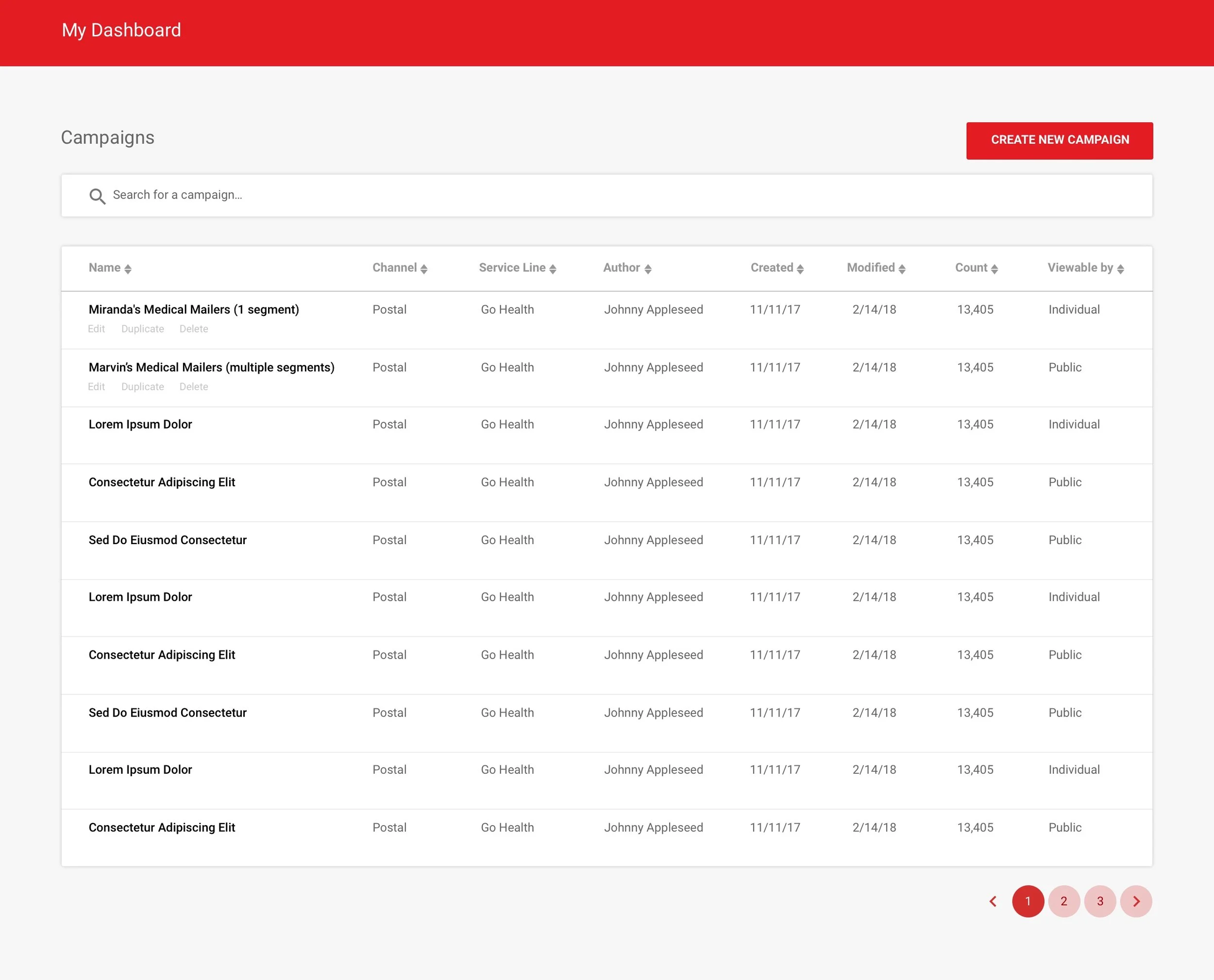
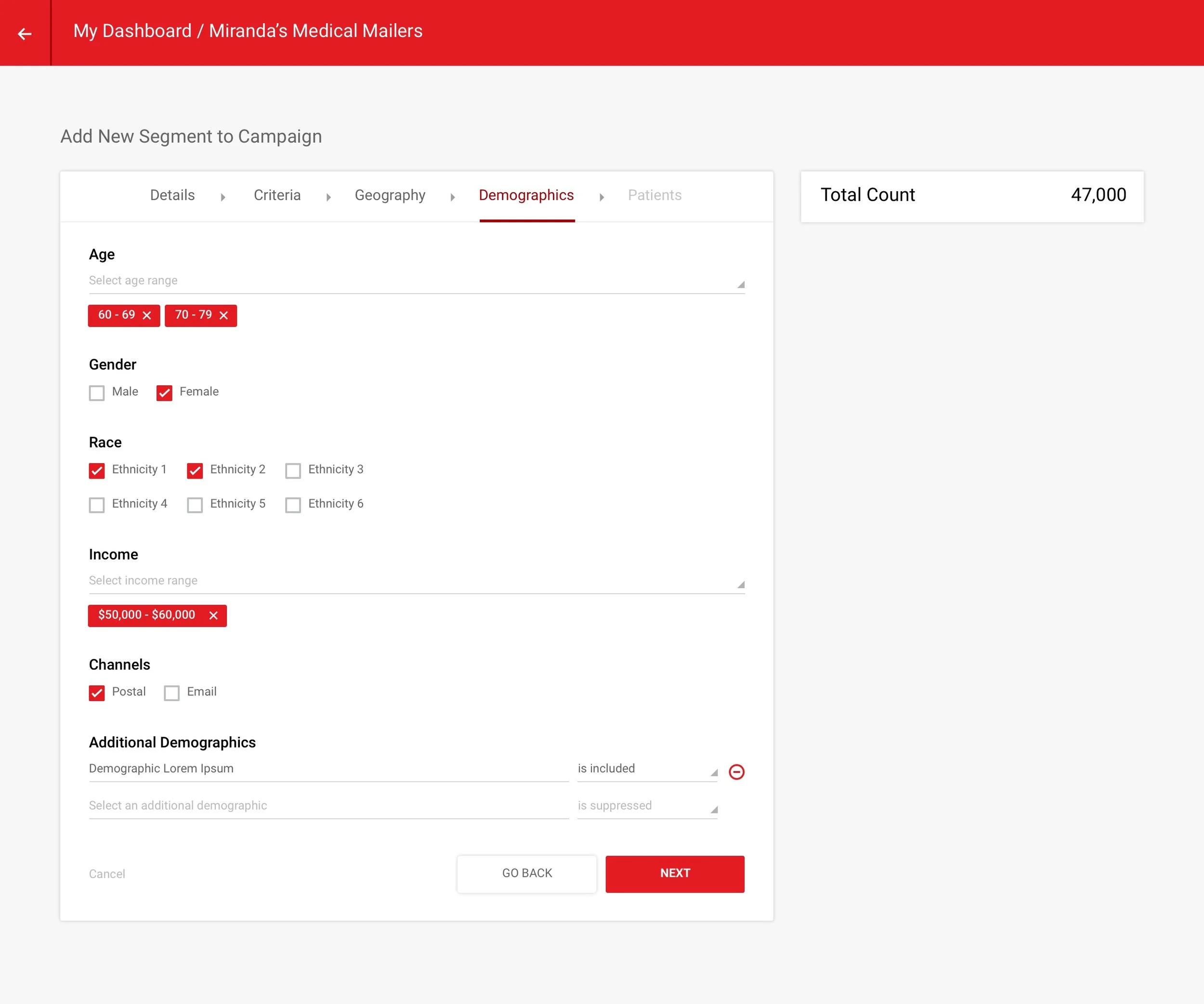
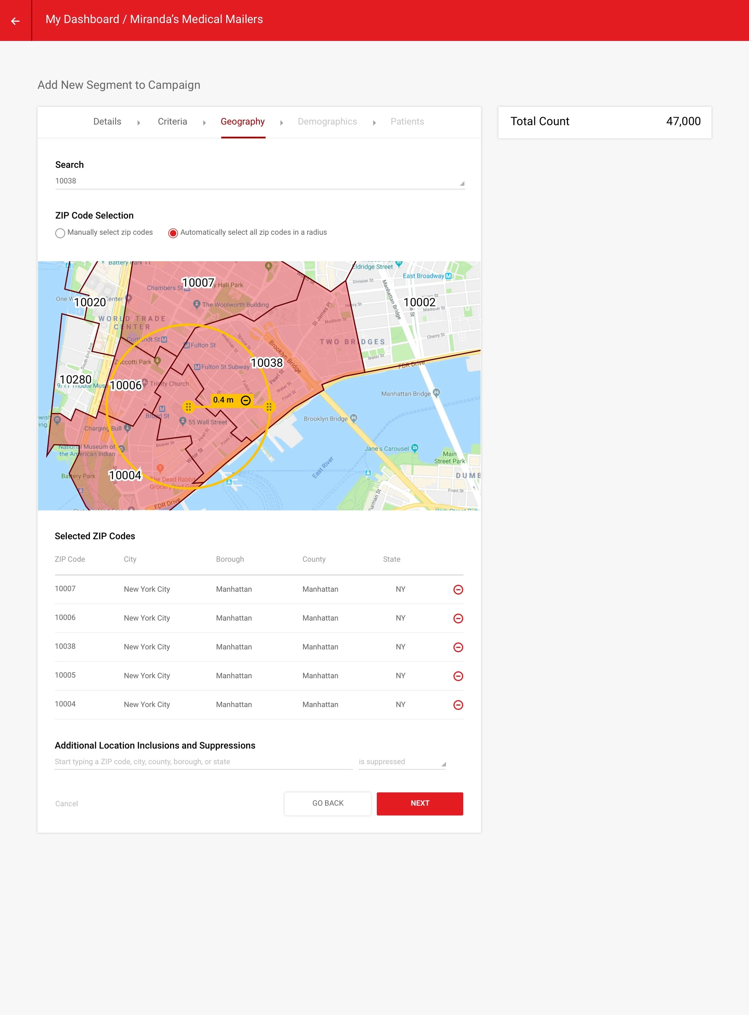
Selected Pages From Final Design
Interactive Prototype
I used the Craft plugin for Sketch to quickly create an interactive prototype in Invision. We used this prototype during client presentations and sent a link to the prototype to the client after. This greatly helped them wrap their heads around the design.
3. Outcome
Reach Marketing approved our designs and their software developers made the designs into a working product.
